Logo Design
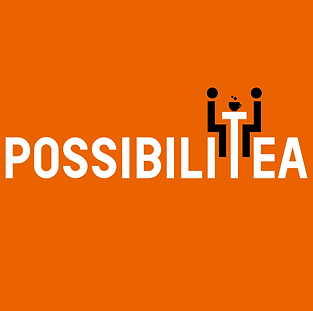
After nine months into business, PossibliTea, a creative agency that specializes in movie marketing and event promotions wanted to start building and establishing their brand. Starting off with designing a new logo, they wanted to embody the essence of their firm and build an identity that their clients would remember
Design Process
An immersion interview with the core team of PossibiliTea provided insight into the company's strategic priorities, prior client experience and future plans. A word-map was drafted based on these discussions

First drafts were created based on 4 key themes identified in the word-mapping exercise


"Quirky" - Combining Typography with tea-cup imagery
"Transformation" - Represented by the art of Origami
"Out of the box" - Formal, yet unconventional

"Many Solutions" - Overlaying of multiple solutions to find the perfect one
The idea of a typography logo resonated with the PossibiliTea team, they were also insistent on retaining the tea cup imagery as an aspect of their brand. Considering this, the next set of drafts were based on a typographic approach


The finalized logo was a typographic take on what PossibiliTea strives to be - your creative partner. Sit down with them over a cup of tea and discuss all of your creative and marketing needs
The finalized color scheme of Orange - White - Black were picked keeping in mind the fresh and bold image PossibliTea feels is part of their core company values


Social Media Templates
Once their logo was established, the team at PossibiliTea were insistent on the tea inspired imagery playing a role in all of their marketing/communication material. The first of these were social media template designs
Design Process
The short nature of the assignment prompted me to utilize an instinct-driven approach, the templates were then validated with the trends seen in social media marketing posts of other companies in the same space
I opted for a minimal template to focus the user's attention on the content before anything else

Visiting Cards
The founding team at PossibiliTea is constantly looking at ways to differentiate themselves from the competition. One of the aspects they felt would leave a lasting impression was a unique visiting card.
Design Process
"Unique" is a subjective term. My initial brainstorming gave me two directions to approach uniqueness - aesthetics vs. function
An aesthetic driven "unique" design would capture a viewers attention, but its relevance would be driven by graphic design trends of the time. Hence, I opted to approach function as the uniqueness driver for the card
By building on the narrative set by "discussions over tea" as a metaphor for working with PossibiliTea, I pitched the idea to have cards that doubled as coasters when turned over


